
INDUSTRY
ROLE
DELIVERABLES
TIMEFRAME
CHALLENGE
MY ROLE
IMPACT

PROBLEM
Haier Europe is a group assembled through acquisition, with plants, offices and teams across the continent, each carrying its own history and visual habits. The corporate brand had to feel like one company in physical spaces, inside the organisation, and externally on topics like sustainability, where credibility matters more than visibility. The constraint was consistent across every brief: each new touchpoint had to extend the Haier master brand, not compete with it. And most of it would be built by people who aren't designers: facility managers, signage suppliers, HR and the sustainability team.
THE SOLUTION
Every project after the first was built from the same raw material.
Logo, colour and typography are fixed globally. The angular, faceted Haier pattern is where there was room to work. It became the connective tissue of everything that followed: cropping photography on HQ walls, framing wayfinding in factories, and eventually forming the building blocks of every sub-brand mark.


GUIDELINES FOR THE INSTALLER
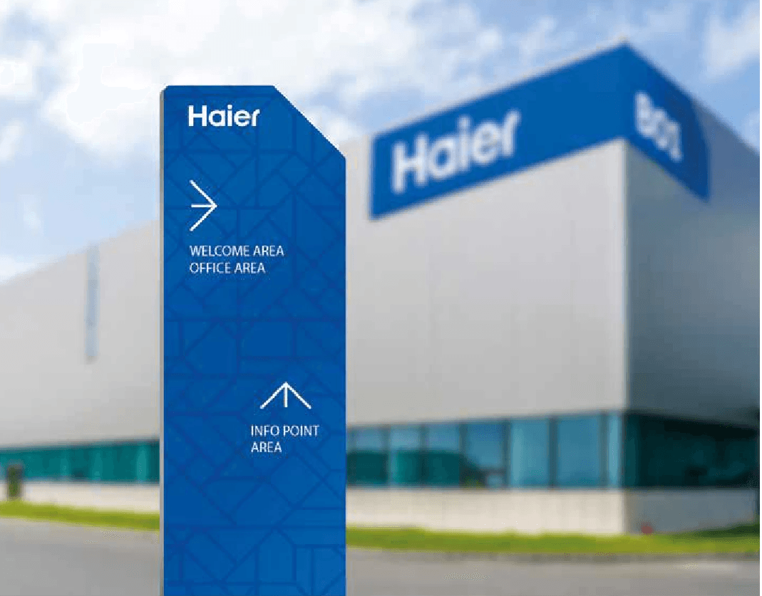
I designed the Factory Branding Guidelines for Haier's European plants with plant managers and signage suppliers as the audience. That meant proportion systems and dimensioned drawings for every sign type (external plant signage, flags, parking, loading-dock numbering, internal wayfinding) so a supplier in any country could produce it right the first time.


THE WORKPLACE AS A BRAND MEDIUM
For the Haier Europe headquarters, the same proportion logic moved indoors: external sign, reception and welcome totem, totem wayfinding, hallway image walls, office and meeting-room graphics, door signage. I cropped photography into the pattern's triangles and diamonds so lifestyle imagery and geometry read as a single surface. The Haier Attitude hallway turned company values such as Entrepreneurship, Zero Distance and Ecosystem thinking into walls people pass every day. The same language carried into internal communication: the "Haier Europe means..." booklet greeted people with a single line, "Welcome home, entrepreneur."


A SUSTAINABILITY MARK FROM THE MASTER BRAND
Sustainability needed its own recognisable signature without looking like a separate company. I developed three routes, each combining the Haier pattern with a tree symbol, and tested every route across app icon, monochrome, print collateral, merchandise and roll-up formats. The chosen route folds a stylised tree into the pattern's square, so it reads as Haier first and sustainability second. The mark now signs Haier Europe's sustainability reporting and climate communication.
THE ACADEMY IDENTITY
In 2026 the brief came back for Haier Europe Academy, the company's internal learning programme. I developed two proposals, each pairing the Haier pattern with a learning symbol (an open book, or a pencil and laptop), and built a five-colour palette where each colour stands for a company value: Entrepreneurship, Agility, Zero Distance, Ecosystem, Build Trust. Five years in, the pattern that started on factory signs is still generating new marks.
RESULTS
In a locked global system there is always one element with room to move. Build everything from it.

